Reverse Design: Half-Life
If you're interested in more research like this, most of it is going to be in video format over on the Forum's YouTube Channel. You can also support future work through the new Patreon campaign.
Also, you can now get the entire Reverse Design Series in print! The print editions are the definitive versions of the books. They are revised, profesionally edited, beautifully laid out, and expanded with new content.
Introduction
This is fourth entry in the reverse design series, attempting to analyze all of the design choices that went into the classic game Half-Life. The first three books in this series were written about Final Fantasy 6, Chrono Trigger and Super Mario World. You do not need to read those books to understand this one. Indeed, the first two books (FF6, Chrono Trigger) are mostly irrelevant to this one, although hopefully they are interesting in their own right. Some of the game design theory from Super Mario World, however, does show up in this book, because it shares with Half-Life a core design structure. The Challenge/Cadence/Skill Theme (CCST) structure, which Nintendo invented in Super Mario World, still shows up in games designed today. The CCST structure also appears in Half-Life, although there are some significant modifications to that structure that emerge from this game. To help new readers catch up, this introduction will review the CCST structure so that you do not need to read Reverse Design: Super Mario World before beginning this book. As was the case with the last book, however, this book is best used while playing the game. That is, you’ll understand a lot more of this book’s content if you are playing Half-Life while you read through it.
There are two big, historically important design changes that take place in Half-Life, and the evolution from the composite/CCST style into the set piece style is the first one. Half-Life is a transitional game, a game that has one foot of its design in two different eras. On the one side, there are numerous examples of the traditional CCST structure in this game. On the other side, the majority of the game’s content takes place as set pieces rather than challenges. Challenges are the fundamental unit of content in a composite game, and they tend to be brief and densely packed into a level. Set pieces, on the other hand, are much longer than challenges and tend to be spread out across a level less densely than challenges. Later on we’ll get into a much more comprehensive definition and overview of what I mean by the terms “composite game” and “set piece.” The important concept to know is that Half-Life was the first real-time, mainstream videogame to deliver content as set pieces.
The other important historical development occurring in Half-Life is the development of cover. The cover-based shooter is, as of this writing, one of the most popular forms of shooter in both the first-person shooter (hereafter FPS) and third-person shooter genres. It wasn’t always this way; the earliest FPS games are much closer to a type of shooter we now call the arena shooter. Like their modern descendants, the ancestors of the arena shooter emphasize free-ranging movement and quick reaction times. The cover-based shooter emphasizes using the structural features of the map to obtain tactical advantages. While cover does exist in a rudimentary sense in games like Doom, Quake and Goldeneye, Half-Life begins to develop the vocabulary of cover both in structure and in use. (Half-Life’s closest contemporary, Rainbow Six, also did this at the same time, but neither game seems to have influenced the other.) Considering that Half-Life inherits from its ancestors only the most basic forms of cover, the amount of progress that it makes in advancing the design of shooter cover is remarkable. By the end of chapter 13 Half-Life has shown us five separate segments that each progressively advance the design and use of cover in the FPS. We will take a look at each development in detail.
A Brief Overview of Videogame Design History
Through the Reverse Design series and other documents, we have already set forward the overall history of videogame design several times. Therefore, for this summary I will try to be as brief and as specific to Half-Life as possible about the overall history of games. We will go into great depth about the history of the FPS, however, because of how relevant it is to Half-Life's design. For a more in-depth look at videogame design history, you can see the initial article about it, or the first few sections of Reverse Design: Super Mario World, which covers the composite era in greater depth. These shorter overviews will make the bigger picture of game design history much clearer. That said, it isn't necessary to read them; a synopsis of those articles will follow this introduction. For this book, we're going to focus on the transition from the composite era into the set piece era, and how that was an inevitable consequence of the collision of Western development techniques with Japanese game design styles. Half-Life straddles the composite and set piece eras in a significant way, and so it makes for a great example of the third great inflection point in videogame design history.
The history of videogame design, as we understand the field today, began in 1978 with the game Space Invaders. Obviously, videogames had been invented before this, but Space Invaders was the first game to demonstrate the core principle of videogame design. The designer of Space Invaders, Tomohiro Nishikado, was also the lead engineer responsible for building the physical components of the arcade machine. Because of an error in the way he configured the physical setup of the game, the ranks of enemies (the "space invaders" themselves) moved progressively faster as the player cleared the level of them. This meant that every level would get progressively harder toward the end, and then the difficulty would drop off considerably when the next level started. Although this was accidental, Nishikado kept this feature in the game and then embellished it by making the beginning of each level successively (but only slightly) more difficult. You can visualize the difficulty of the game like so:
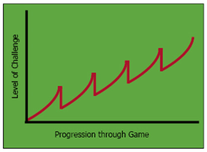
Essentially, what Nishikado had done was to treat difficulty as something that could slide up and along an axis. This axis was entirely controlled by enemy behavior, and so we can call it the axis of obstacles—obstacles being the things out of a player's direct control which stand in the way of victory.
In the early 1980s, other Japanese designers began to experiment with the idea of another axis, one that actually does deal with an element of player control. This was the axis of abilities, which changed the things that players could do. There were two schools of thought as far as the axis of abilities went in the arcade era. The most obvious interpretation of the axis of abilities was in games like Phoenix, Galaga or Pac-Man which moved player abilities up and down on an axis of greater or lesser power. For example, in Galaga, the multi-ship powerup doubled the player's firepower.
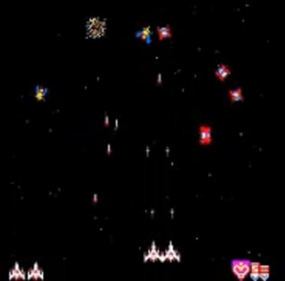
But these powers were always just a secret back door into the axis of obstacles. With Galaga, it's obvious that the designers were simply increasing the ship’s shooting ability numerically—doubling it. It's not that different than if the developers were to simply cut the number of enemies by a large fraction. In Pac-Man it's less obvious but still essentially the same design idea. Over time, the duration of the power pellet's effect gradually diminishes while the enemies only grow in difficulty. Everything the player needs to know about the power pellet involves the duration of its use, which shrinks to nothing as the game goes on. This quantitative focus in powerups is just a back door into quantitative manipulation of the axis of obstacles.
The other school of thought on the axis of abilities sprang from the work of Shigeru Miyamoto. While most of the games of the early 1980s used powerups as an extra way to manipulate the axis of obstacles, Miyamoto's first game—Donkey Kong—did something very different. When Jump Man (Mario's first incarnation) gains the Hammer powerup in Donkey Kong, he loses the ability to jump, but gains the ability to attack enemies. Or, to put it another way, the game temporarily stops being a platformer and starts being an action game.
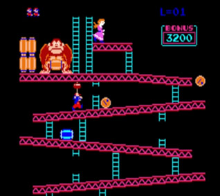
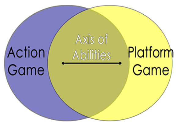
Instead of treating the axis of player abilities as another quantitative modifier of game difficulty, Donkey Kong sets up a scenario in which the axis of player abilities is one that moves between genres. In Donkey Kong, this was a very rudimentary idea and probably the product of serendipity rather than a clear plan, but Miyamoto and his team must have gotten the sense that moving between genres within a game would be the design style of the future. The great strength of a game that moved between genres (even if only in a small way) is that the game could present new challenges to the player without always getting quantitatively more difficult. The great weakness of arcade games was that, by constantly pushing up the axis of obstacles, they would lose many players who became frustrated by the skyrocketing difficulty before they could really get into the game.
In 1985, Miyamoto and his team created the first real composite game, Super Mario Bros. A composite game is a game in which a player can use the mechanics of one genre to solve the problems of another genre. The prototypical example is Super Mario Bros, in which the player can use platforming mechanics (jumping with momentum) to solve action game problems (defeating or avoiding enemies). The secret of a composite game, though, is not just combining two genres, but rather moving between those two genres without ever abandoning either one. Each level in Super Mario Bros "declines" (literally, leans toward) one of the two composited genres while never ceasing to be a combination of both. In the screenshots below you can probably guess whether the levels in question are in the platformer (lots of jumping) or action (more combat) declensions.

The back-and-forth motion between genres in the composite creates "composite flow." This is a phenomenon similar to ordinary psychological flow, in that the player becomes immersed in the task and forgets everything else. The unique feature of composite flow is that it is achieved by moving from one genre declension to the other just before the player gets bored or frustrated. All the while, however, the game is continuously getting more difficult. If you were to make a graph of it, it would look something like the figure you see below.
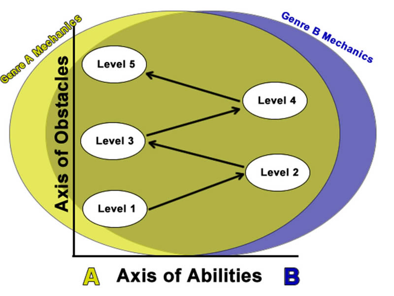
The axis of obstacles is still the foundation of the composite game; it's just that instead of the axis of abilities being a mere appendage of the axis of obstacles, it truly acts as another axis. Immediately after Super Mario Bros came out, videogame designers all over the world latched onto the idea of the composite game and started making their own combinations.
Composite design thoroughly displaced the arcade style of design, and so we call the period from 1985 until about 1998 the composite period, after which point another game design style became equally popular. During this time dozens of different composites flourished, and the practice of composite design advanced considerably. Designers created some truly great composite games through innovative combinations. Mega Man and Metroid both added shooting to platformers to great effect. Sonic the Hedgehog took the Action/Platformer composite of Super Mario Bros and added racing game mechanics. Castlevania added RPG elements to the Mario formula. ActRaiser created an odd but extremely likeable composite out of the Simulation, RPG and Action/Platformer combination. Even after the heyday of composite games, we still see new composites like Portal, which allows the player to solve platforming problems with shooter mechanics, or Katamari Damacy, which is really a racing game that operates by an accelerated RPG level-up system. Half-Life is partly a composite game, involving both the FPS genre and a considerable amount of platforming. The relationship between Half-Life's composite parts is, in fact, unusually complicated, because Half-Life is both a composite game and a set piece game, and the kind of composite game that Half-Life draws from has some special properties, too.
One of the most surprising developments of the composite era was the creation of new genres out of old ones. Plenty of games combined two genres in a way that left those two genres apparently intact. For example, everyone can see the way that Mega Man or Metroid alternates between shooter and platform content and sometimes mixes the two. Similarly, the RPG and action elements of The Legend of Zelda are still distinct. In the middle of the composite era, however, composites began to appear where the mix was blurrier. The real-time strategy genre is a good example of this. There are plenty of examples of strategy videogames, but players of the "pure strat" game tend to disdain the RTS as being not really "strategy." In a certain sense, this is correct because the RTS is quite a bit more than just strategy. Dune 2, the first real RTS, mixed several other genres into the formula. By adding not just action game combat but also Sim-City-style economic simulation, the RTS became its own distinct genre. That new genre didn't really retain the audiences of any of its composited parts; instead it created a new RTS-specific audience.
The FPS genre is largely the same. Obviously the FPS is a shooter and shooters go all the way back to the 1970s—but consider how little overlap there is between the hardcore enthusiasts of the FPS and the 'shmup, for example. They're both shooters, but the audience is different, and that difference stems from the genre composite. The first FPS, Wolfenstein 3D, brought together the aiming and dodging elements of the shooter, but it adopted first-person mechanics, exploration and level design of the CRPG.
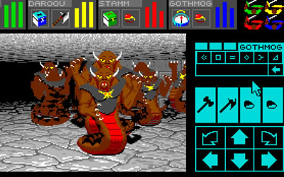
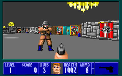
On the left is the layout of the UI from a PC RPG (source: Wikipedia). On the right is a screenshot from Wolfenstein 3D. Wolfenstein 3D retains the elaborate dungeon, the stat-oriented HUD, the secret treasure rooms and progressively more powerful equips of an RPG. It has the fast-paced, live-action feel of a shooter. Despite this obvious mixture, the FPS does not have the same audience as the CRPG or the ‘shmup. The FPS has its own audience, one that has come to be a dominant force in gaming today.
Before we get to the set piece era, I want to highlight a design practice from the composite era which carried over into Half-Life. Earlier I mentioned the challenge, cadence, skill theme (CCST) structure, which appeared first in Super Mario World but which then spread to other games. At a basic level, this structure is a way of tying together the challenges in a level so that the level seems consistent, but also so that it becomes progressively more challenging. The consistency arises from a precise form of iteration. Designers start with a simple idea at the beginning of a level. I’ll use some examples from Super Mario World to illustrate the point first, because it’s much easier to see the iterations in that game, then we’ll see some examples from Half-Life. A Mario level starts off with a simple challenge, made up of just a few jumps. This challenge then gets more complicated.
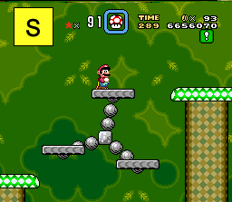
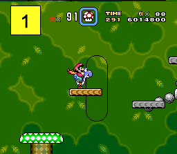
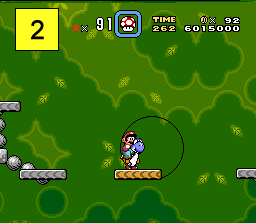
You can see here how in the first iteration, the number of available platforms has decreased, and the type of platform has also changed. In the second iteration the minimum distance between platforms and the total number of jumps have gone up. The first iteration is an example of mostly qualitative changes, which I call an evolution. The second is an example of a quantitative change (the distance between platforms grows numerically), which I call an expansion. These terms are used throughout the book, and are necessary to understanding some of the concepts that appear later.
Evolutions and expansions on their own are meaningful, but the relation of sequential iterations is where we begin to understand the real structure of a game’s design. When we see several iterations upon one design idea, I call the relationship between those iterations the cadence of a level. The relationship between many of the set pieces in Half-Life can be described this way as well. Half-Life doesn’t structure entire levels the way a composite game would; it doesn’t design whole levels around any single design philosophy. Half-Life is a transitional game and so is inconsistent in the design styles it uses, but there are definitely segments of the game in which the designers take the same basic design idea (or core of a set piece) and iterate it several times to form a cadence structure. A good example of this is the very similar arena-style challenges in chapter 14.
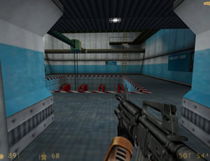
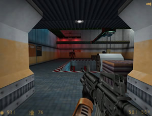
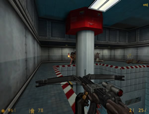
You can see how the same arena-style room with a cut-out floor in the center is the basis for all three of these set pieces, and yet each one is different. One set piece adds barnacles; one set piece puts three grunts on the floor instead of dividing them between floor and catwalks. One set piece has multiple teleport-spawns. The cadence of chapter 14 tells us something—that the designers are now shifting away from the cover-based content they began with, and are now focusing on a series of evolving arena encounters. Of course, the cadence of level fourteen isn’t composed of challenges, it’s composed of set pieces, and that difference is meaningful.
Although Half-Life uses many composite design techniques, it is also one of the first examples of the next era of game design: the set piece era. The set piece style of game design grew out of the practical necessities of increasingly large software projects. As videogame production grew in size, duration and profitability, it was inevitable that the business and production constraints of making games would impact design. When this happened, game design entered the set piece era. Until the mid-1990s, videogames had been created by relatively small teams who would work together for multiple games. Their small size and familiarity with one another made communication easy, and so it was easy for those teams to adhere to a shared vision for a game. Once teams grew larger and had more replaceable parts (with people moving onto or off of a project frequently), it became harder for the team to maintain a single design style. Thus, software production methods which were employed in non-game projects began to have more prevalence in the production of games. The impact on game design that these new methods had was visible as modularity. If members of the project couldn’t always communicate easily with one another, and if staff members were moving on and off the project frequently, it made sense for projects to modularize their content to a greater degree; modular content offers convenience. Modular content also requires less intensive collaboration because solo designers can create numerous small modules from pre-existing tools and assets, without having to draw in other team members very often. That module can be moved around in a game to find wherever it fits. As long as that module fits the style of the game, everything else about it is essentially fungible.
The module that began to appear in Half-Life was the set piece. There are three important characteristics of a set piece. A set piece is an extended, self-contained and quantitatively-focused unit of content.
- By extended, I mean that the content of a set piece lasts much longer than the content of a challenge, which was the primary unit of content in a composite game. A level in a composite game would have many challenges, usually more than ten, and each challenge would last only a few seconds. Set pieces tend to last for around sixty seconds or more, and can last as long as five minutes each. Accordingly, there are fewer set pieces in a game like Half-Life than there are challenges in a typical composite game.
- Self-containment means two things. The first is that a set piece is a unified action; once the player begins a set piece, they have to finish it in order to move on. The second aspect of self-containment is the way that every set piece tends to contain within it everything that the player needs for that set piece. The best example of this is the phenomenon of regenerating health/shields. If the player character can heal fully between every set piece, then the designers never have to worry about whether the player is entering set piece seven with enough health to survive after completing set pieces one through six. The same is largely true of ammo; if every enemy in a set piece drops a little bit of ammo and maybe a grenade or two, the designers never have to worry about the player suddenly running out. The set piece contains everything the player needs to beat it.
- The final defining aspect of a set piece is an emphasis on quantitative changes in content between modules. While composite games focused on both qualitative and quantitative changes, it was easier for set piece games to emphasize quantitative changes because they are so easy to communicate. If a series of replaceable low-level designers are simply trying to push out as many set pieces as possible while using the same set of tools, they can simply make sure that each successive set piece has more enemy marines than the previous one did so that the difficulty of the game keeps rising to challenge the player.
All of what I said in the list above is a simplification, of course; no game is entirely built on a string of set pieces that only change numerically. Half-Life’s focus on qualitative variation is striking, in fact. Although Half-Life begins the trend of set pieces, but it doesn’t develop the idea all the way into its modern form. The biggest discrepancy between Half-Life and the “modern” set piece game is the absence of regenerating health. Half-Life takes a step in that direction; a majority of the set pieces in the game feature some kind of health-regeneration apparatus before or after the battle—but very few set pieces feature health regenerating items in the middle of the fight.
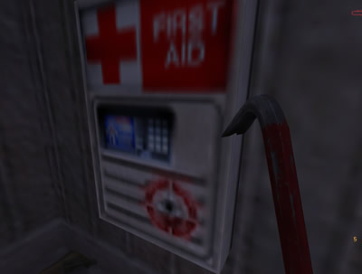
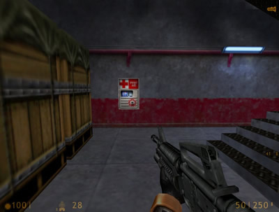
The regularity with which these regeneration stations come between chapters three and thirteen was especially astonishing for the time. The great FPS games had previously featured a lot of level-long attrition. It’s clear that the designers of Half-Life were trying to move to a more modularized kind of content, but it hadn’t yet reached the point where the player could hide behind a piece of cover and regenerate fully. That extreme would come a few years later. Additionally, Half-Life lacked the quantitative emphasis that its descendants would have. There are sections in the game that are more quantitative than others—chapters eight, thirteen and much of Xen spring to mind—but overall the designers of Half-Life still employed a much more cadence-like sequence of qualitative evolutions. These two differences are part of Half-Life’s identity as a transitional game; even while beginning the set piece era, it shows its composite heritage.
The Vocabulary of Cover
The story of Half-Life's design is largely the story of shooter cover. The largest single portion of the game's content is a series of set pieces that involve meaningful cover. But before I begin to talk about cover, I want to come up with a functional definition for the purposes of this book. Technically, anything that a player uses to hide from enemy fire is cover, but that definition is unhelpfully broad. Cover in Half-Life is at its most meaningful when it allows the player to move in and out of safety while firing on the enemies. To illustrate, I'll pull from a different game from the Half-Life era: Time Crisis. In Time Crisis, the player is able to use a pedal (in the arcade) or button (at home) to move their character in and out of the sheltering safety of a wall, box or other object.
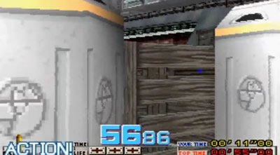
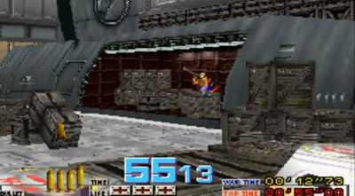
(Images taken from Lollybomb's TAS playthrough.) While in cover, the player character is unhittable and can reload, but the player cannot see the enemy or fire. The player can press the pedal or button to pop out of the cover and take shots. Good players will know exactly when to pop in and out of cover so as to avoid damage and still shoot enemies. It is this pop-in/pop-out process which defines what I mean by cover. If the player has more than a couple of seconds where he or she can use cover in this way, then the game is deploying a cover-based set piece.
The Earliest Cover
As far back as Space Invaders, cover has been a part of shooter designs. We already saw in the previous section how Space Invaders was a very forward-looking game for its basic design structure, but its shooter-specific elements were also prescient. Not only did Space Invaders have cover when many subsequent shooters did not, but that cover was destructible.
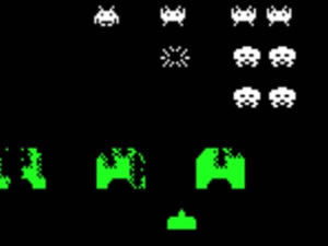
Cover would disappear as a meaningful part of shooter design until the composite era. Side-scrollers in the mode of Galaga became the dominant type of shooter during the arcade and early composite era. Having little or no cover, the design of scrolling shooters (would later be called 'shmups) instead emphasized constant movement and did so in a way that diverged from the path eventually taken by Half-Life. The first problem in a scrolling shooter is not being shot.
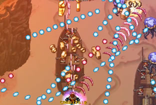
Actually hitting targets is secondary to dodging bullets, because the player has so little in the way of HP and extra lives. As the genre evolved, this emphasis on dodge-first, fire-second mechanics became increasingly apparent. Consider how, in the second screenshot above, the player's bullets are multiplied and fired at expanding angles, and many of the bullets are as big as the enemies they're supposed to hit. This powerup is designed to aid players whose first concern is surviving, not aiming. Usually, those weapons also feature infinite ammunition as well, because precision firing is not the point of the game. Obviously, as a player masters the game they will be able to concentrate on both dodging and aiming, but moving and dodging are the central skills.
During the composite era, the shooter genre was an important ingredient in many classic games like Metroid, Mega Man and Contra. These shooters all made some use of what we can call cover, although its implementation was different than that of a pure shooter. All of the games listed above are composites of the platformer and shooter genres, and so most instances of cover take the form of platforms.
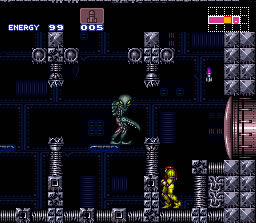
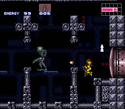
The player isn't hiding behind an object as much as waiting to make a jump. Although many platforms or other pieces of level architecture serve as cover, their true purpose is to force the player to make platformer-style jumps. Often, those jumps are combined with shooting tasks, but this means that a lot of the "cover" in those games makes the tasks in question more difficult, rather than less difficult. While there are definitely some similarities between this and what we'll eventually see in the FPS genre, that one difference is very important. Half-Life has plenty of examples of platforming content, but only two examples where that platforming content blends with shooting in a meaningful way.
The FPS Beginnings
Cover in the first person shooter began, like so many great videogame design ideas, as an accident. We've already discussed how the level design of the early first person shooters was derived from western CRPGs and adventure games. The game to show this most clearly is the first real FPS, Wolfenstein 3D. The very dungeon-like structure of early Wolfenstein levels is obvious just from even a cursory play-through. These levels don't resemble anything in the modern FPS.
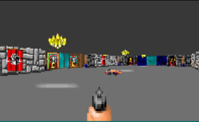
Wolfenstein features nothing immediately identifiable as dedicated cover. All those walls and doors look alike, regardless of whether there are enemies beyond them or not. That said, the walls and doors of the dungeon can be used as cover because of the way that enemy AI works. In Wolfenstein, enemies move in herds. There are three principal characteristics of an enemy herd:
- Herds of enemies share aggro.
- Herds of enemies feature no distinct tactical roles, although they may have heterogeneous firing ranges and projectile types
- Herds of enemies, no matter what shape they start in, always collapse on the player
Not every encounter with enemies is with a herd; there are plenty of solo enemies in W3D, too. When a player does encounter a herd, though, what tends to happen is that a room full of soldiers will start moving towards the player character as he stands at the point of encounter. That point of encounter is most often a doorway or aperture into a new room, even though that door isn’t designed to operate as cover, merely as a way to inflict a sudden surprise on the player. When the herd collapses on the player, moving and shooting, the player can move backwards through the aperture, cutting off the enemy's angle of fire and stacking them up neatly in the aperture space or around the edge of a corner.
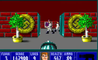
(Image taken from TTDLX's playthrough.) By reducing the number of angles from which enemies can shoot, and stacking enemies up so they can't fire around each other, the player is in a very basic form of cover.
The architecture and AI in W3D do not demonstrate any intent on the part of the designers to allow for what we perceive as cover mechanics. Rather, the cover-like strategies which players employ are an emergent property that the designers probably didn't plan for in the original game. Every doorway is more or less the same shape, regardless of its proximity to a group of enemies, meaning that no door is tactically more useful than any other. The doors in the game close automatically after just a few seconds, meaning that sustained firefights through a doorway are interrupted without much warning. Furthermore, the controls in W3D do not allow for strafing. The left or right movement controls rotate the player character, and mouse controls (which were added later) are not independent of key controls either. Ducking in and out of cover is difficult and only possible in a few limited circumstances.
The development team must have noticed the emergent strategy of using rudimentary cover, because the sequel to W3D, Spear of Destiny, takes frequent advantage of it as a part of level design. What we see in SoD are huge, oddly-structured herds which are designed to force the player into the "cover" situations described above. Although the whole game is more or less based around this one idea, it can take a variety of forms in terms of practical execution.
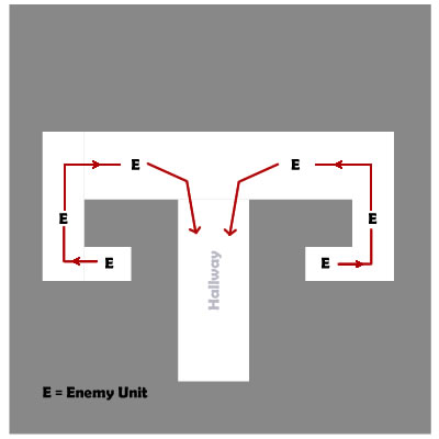
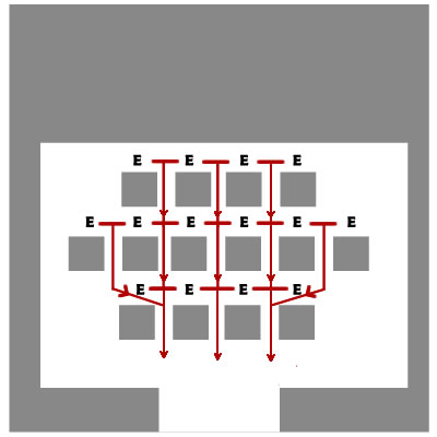
Both of the encounters above operate by the same principle: a large herd collapses on the player and the unusual level architecture causes the herd's movement to approach the player character in a variety of strange ways. The ram's-horns structure on the left sends successive waves of enemies at the player. The game's AI doesn't support delayed movement, but it does support herds of any shape, and so by staggering the enemies geographically, the designers were able to stagger their emergence from the corridors as well. The player can manipulate the enemy action by backing down the hallway and stretching that herd out further, to pick them off one or two at a time from behind a corner. In the "forest" of columns on the right, above, the herd will suddenly appear from behind those columns when the player obtains aggro on any one of them. The player has to move around the outside perimeter of the columns to isolate small groups of enemies before the whole herd comes out into the open. By changing position, the player keeps the herd in the columns, where they can't all fire at once.
While it's clear that the designers of SoD are able to communicate to the player the importance of minimizing exposure to enemy fire by using the terrain, it still doesn't look like cover as we understand it. For one thing, in both of those examples above, the player is mostly standing or moving around in open space; that's the case throughout W3D and SoD. It’s really the enemies that are in what we might call the "cover" rather than the player, because they get tangled up on doorframes. Later FPSes preserve this to some degree; doorways are always a great place to stack enemies up. Some FPS games also preserve the constant movement and large open spaces of W3D and SoD, but Half-Life, as we'll see, diverges from that idea in a profound way.
The next evolution in the meaning of cover comes, of course, from the early Doom series. There are four big advances in Doom and Doom 2 that change the way the player interacts with enemies. The biggest change was the introduction of the ability to strafe. Modern players trying Doom for the first time may find that strafing ability to be much clumsier than what they're used to, but they expect to find it and they do. Players who started with W3D, on the other hand, would have found the ability to strafe to be an incredible boon, making it possible to dodge enemy fire in a way hitherto impossible. Really, Doom was just reclaiming an ability lost when the shooter took on the FPS form. Strafing is essential in Space Invaders, and every scrolling shooter that followed it, because those games were about dodging as much as they were about shooting. With the ability to strafe came the ability to use level architecture as real cover by popping in and out of cover.
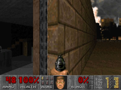
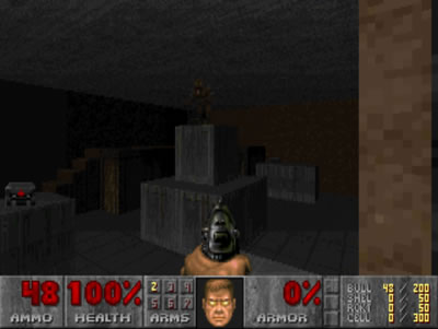
Thus, the second big advance was in a greater variety of level design forms. These forms are fairly chaotic, and mostly defy any form of organized classification, but they're a lot closer to what we understand as being "cover" in the modern sense of the word than anything in Wolfenstein was. You can see in the images above how these new architectural developments were only usable because of the player’s ability to strafe.
The other two big changes were the introduction of the iconic (but short-lived) monster closet, and the arena-style disposition of health and ammo. The monster closet is one of the most highly-recognizable features of the FPS genre, and it definitely had an impact on level design in its heyday. For those who aren't familiar with the term, a monster closet is simply a hidden cache of enemies which opens when a player passes a certain point or takes a certain action. Triggers for monster closet openings can include hitting a switch that also controls doorways, or even picking up a new weapon or item. Much of what a monster closet did was simply to refill areas already cleared of enemies by the player at an earlier time.
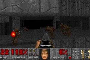
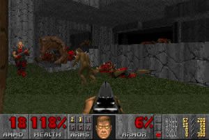
The area the player is staring back at in these screenshots is the passage that actually leads to the dead end where the player stands. A large number of enemies emerge from monster closets in previously-cleared hallways and move, as a herd, toward the player. One rule that tends to be true for monster closets in general is that closets that open at the same time tend to feature enemies who are in a single herd, no matter how far apart those closets might be. The other purpose of a monster closet was to fuel a frantic arena battle. Many monster closets in later battles put enemies on every single side of the player character, meaning that the player has to be moving constantly to avoid close-range fire.
The use of monster closets to turn empty rooms into frenetic arena encounters is where the last big Doom innovation, the disposition of items, comes into play. In W3D and SoD, healing items and treasure were located in hidden rooms and alcoves, much as they would be in an RPG or adventure game. In Doom, many of those items are strewn around the perimeter of an intense arena encounter (in this case, they’re actually on the closet doors) to encourage movement—especially circle strafing.
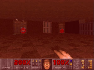
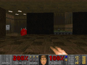
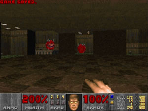
The obvious purpose of these items is to replenish the player character's health when numerous demons suddenly leap out of the walls and start firing. All of the frantic running helps to dodge enemy fire, but it also allows the player to pick up items from around the floor of the arena. The ammo, health and armor make it possible to sustain an intense, roving battle without real cover. Later in the history of the shooter these items are going to appear less often in the middle of battle (although they’ll never cease to appear there), and will be moved to the battle’s beginning and end. Sometimes, rather than placing items directly in the line of fire, the designers placed health and ammo in the very closets which have opened to let out monsters. The player has to charge through and around the enemies in order to access it. It makes sense for Doom to put its health in dangerous places, because that placement achieves what the Doom designers wanted: reflex-oriented shooting sprees. The game that they were designing is much more frenetic than most of the shooters that we play today; Doom is a kind of game that was much closer to its ‘shmup ancestors than it is to its cover-based descendants.
Big Advances: Quake and Quake 2
Half-Life originally started as a mod of Quake 2, so it's no surprise that it owes much to its immediate ancestor in terms of design as well as in terms of technology. Indeed, the first two Quake games are probably the most influential shooters of all time from a mechanical perspective. Quake 2, especially, solidified the fundamental mechanics that still make up the foundation of contemporary FPS games. Quake made the transition to true 3D. In Wolfenstein and Doom (and the lesser-known Marathon), the environments were 3D but the characters were all 2D sprites that were (effectively) infinitely tall. The player never has to aim upwards (not that it was possible to do so), because both the character's shots and the enemy's sprite have no upper limits on the y-axis. If the player is aiming at the correct coordinates on the x and z axes, the bullets will hit. In Quake, the player has to actually aim at the 3D model of the enemy to hit them. Aiming is actually possible in Quake in a meaningful way, where it wasn’t before. Before Quake the player could only shoot at the center point of the screen; the player had to move their character to move the target icon.
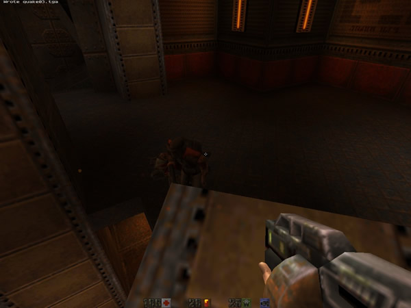
Quake separated the viewing/aiming controls from the movement controls so that the player could fire in any direction—including away from the direction the character faces.
The introduction of true-3D aiming mechanics opened up many new design ideas above the mechanical level. The most widespread of these ideas was the introduction of zone-specific damage (i.e. headshots). Both Goldeneye and the original Team Fortress (a Quake 2 mod) used this as a natural outgrowth of the ability to target enemy models precisely. Another thing both games did was to put a greater emphasis on verticality in their level designs.
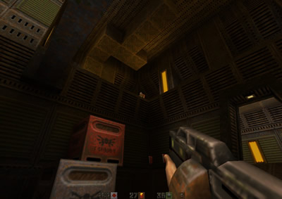
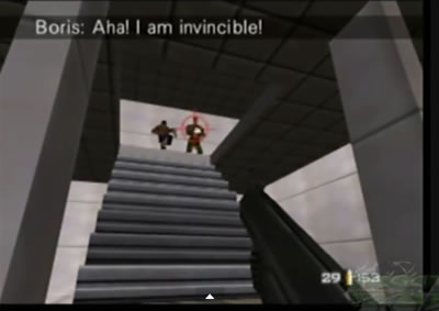
(Image taken from playthrough by NegativeZeroZ.) Half-Life would take both of these things significantly further. One thing I want to point out here about these games though is how the mechanical and supra-mechanical changes like verticality led to the use of modern cover. Once players were finally able to really strafe and aim precisely, popping in and out of doorways or just over the lip of a catwalk to take a quick shot at distant enemies became a viable strategy. In Doom and Wolfenstein, the player's ability to do this was much more limited even when there was a type of “cover” available. In Quake and Goldeneye, it's a lot easier to perform this maneuver, but even then, cover play is really only an emergent property of new mechanics rather than a conscious effort by the designers to create cover-based encounters.
Although Quake had incidental cover and the mechanics to use it, the series went in a very different direction than Half-Life eventually would. Half-Life took the seed of the cover idea from Quake and developed it into an entire game because Quake did not. Quake was designed to be fast-paced and chaotic in the same way that Doom was. The large apertures and empty rooms of Quake certainly don't make it easy to avoid enemy fire.
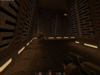
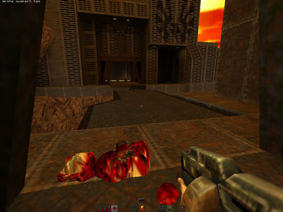
Encounters with some of the large, durable and aggressive enemies in Quake make pop-in/pop-out tactics unsustainable for game-wide usage. For better results the player needs to perform maneuvers like kiting, circle-strafing and jumping up and down through vertical portions of the levels to avoid the enemies. This kind of combat would come to be known (after Half-Life and several more Quake sequels) as the true arena shooter style. The arena style of combat isn’t limited to single player either; many of the most popular multiplayer maps from the early Quake games are actually complete single-player levels with the computer-controlled enemies removed.
Half-Life takes the emergent cover mechanics of Quake and builds the majority of its content from that idea. Half-Life also features some of the arena combat that we traditionally associate with Quake and its descendants, as well as a lot of platforming content which comes from the composite design tradition. These are the three ingredients which make up Half-Life; for the purposes of analysis we'll call each of these ingredients a “design theme.” The single largest design theme is the cover theme, which makes up about 55% of all the set pieces in the game. This theme also sees the greatest amount of development (increasing complexity) from beginning to end. Indeed, Half-Life does so much with the use of cover that most of the lessons we can learn from the game are about cover as it relates to level architecture, pacing and the use of AI and weapons.
The Structure of Half-Life
Even though Half-Life's cover theme represents the largest portion of the game's content, that theme doesn't start until chapter 4, reaches its climax in chapter 12 and then drops off significantly after chapter 13. This means that the cover theme is densely packed into those ten chapters. It also means that the game has a peculiar structure, because there are eighteen chapters and only three design themes to fill them with. There are certainly pieces of content in the game that don't fall into any of the themes; usually these take the form of boss fights or small pieces of through content. Most of the game’s content comes as set pieces, though, and most of the set pieces fall into one of the three themes. Of the three themes, the cover theme is simply the most frequently seen.
One of the most-discussed problems of Half-Life is that the last four chapters (in Xen) are stylistically different from the rest of the game, and also of a lower level of quality. Some of that is the sudden and radical change in the gravity and accompanying emphasis on long-range jumping puzzles. It's a bad idea to introduce sudden, permanent changes to the fundamental physics of a game when the player is more than 80% of the way through it. But I think the real reason that the Xen levels feel so much weaker is that the game design goes backwards in time. Xen, with its sudden lack of meaningful cover, emphasis on arena-style encounters, large hallways/apertures and frequent, small engagements is a lot more like Quake than it is like chapters 4 through 13 of Half-Life. If we see the cover theme as the core of Half-Life's design, then the climax of the game is in chapter 12 (Surface Tension), with chapter 13 serving as a kind of denouement to that. What if the portal that opened in chapter 14 had gone directly to the fight with Nihilanth? I think the overall flow of the game might have seemed a little more even, but that isn't what the designers made.
Instead, the arena theme comes to dominate the later chapters of the game, with large doses of platforming mixed in. In the rest of the game, the incidence of platforming and arena content follows the rhythms of composite flow, although not in the traditional 1:1 ratio that a true composite game might employ. From chapter 4 until chapter 13 what we usually see are two to four set pieces in the cover theme followed by one or two out of the platform theme, the arena theme or a unique piece of through content. There are exceptions to this rule, especially in chapters eight and ten. Chapter 8 has a lot of long, slow through content thanks to the monorail cart Freeman has to ride, and so it eschews the kinds of arena and platforming challenges that might make the chapter much longer. Chapter 10, meanwhile, is entirely made up of platforming—and some fairly orthodox platforming, at that! Chapter 10 could almost be taken from a straight 3D platformer in the way it operates. But starting in chapter 11, set pieces in the arena theme start to appear more often, and then they mostly displace cover-based set pieces in chapter 14 and after with a couple of interesting exceptions.
A Note on Mechanics
This work primarily concerns itself with level design, and little has been said so far of the shooter mechanics at their most basic levels. I have not deliberately ignored them, but I feel that while Half-Life's shooter mechanics are very solid, they are generally unremarkable. The auto-aim (or aim-assist) function, for example, is mostly like other aim-assist mechanics before and after Half-Life. The only big difference in Half-Life is that the always-centered reticle will come unstuck from the center for a second or two if an enemy enters the magnetic area of the auto-aim function. Aside from very minor differences like that (and couple of other things we'll get to, below), there are not huge mechanical innovations in Half-Life. Weapons do not do variable damage (i.e. there are no randomly-chosen critical hits) except when hitting a specific area on the enemy target (i.e. headshots). There are not really any specialized weapons for specific enemies. Only the rocket launcher has a truly novel mechanic in its laser guidance system.
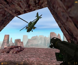
This screenshot is from set piece 12-6, during which Freeman has to fight a helicopter from the mouth of a cave. Forcing the player to track the target with a laser pinpoint defeats that player's ability to hide behind cover. That is, the player can't simply fire a rocket and then duck behind the ledges and walls that would otherwise be available here. This means that players have to learn to shoot rockets at relatively close range in order to shorten the length of time that Freeman is exposed to fire while steering that rocket. That's a novel and important mechanic, but most of the other weapons are simply versions of things which appeared in games before Half-Life or which don’t receive that much development. (For example, the enhanced recoil from the tau cannon is a new idea, but it’s never particularly relevant to any single set piece or platforming puzzle.) What makes the weapons interesting is the way the levels are designed. This becomes a lot more apparent when it comes to multiplayer. If you buy, or have bought, the eBook version of this document, there is a section detailing how the most successful multiplayer maps drew most of their appeal from their use of cover. Many of the more arena-oriented Half-Life maps were forgotten because they were too much like Quake, and did away with all the level-design innovations that really made Half-Life what it was.
The one big exception to everything I wrote above is Half-life's AI. The AI of any game is actually composed of many mechanics, although only two of those mechanics are really continuous throughout the game. Many reviews have credited Half-Life with having some of the best AI of all time, but this impression is the result of a series of clever illusions. While the AI in Half-Life was certainly ahead of its time, many of the most memorable moments in Half-Life are not a result of continuous AI but rather of discrete, one-use scripts and specially-created tools. (There is an entire section about these moments in the later part of this document.) Whether it's an unusual emphasis on grenade-tossing or a sudden and preternatural ability to detect Freeman no matter what he does, these behaviors are examples of custom scripts that exist beyond the normal scope of the AI. Clever level designers can create the illusion of greater enemy intelligence by using hidden scripts, but once players figure out where those traps are laid, they can avoid them. For example, if enemies run only to specific locations, that’s a one-use, custom script and not a part of the general AI. The system of decisions which enemy units can make independent of custom scripts is what really counts as a systematic advance in artificial intelligence.
The fundamental AI which almost all marines are equipped with features two new ideas: cover-seeking and what I call "movement jitter." Cover-seeking is just what it sounds like; under certain conditions, the HECU marines will seek cover. The circumstances vary but generally come down to two criteria. The first criterion is the presence of other marines; if they have companions, marines will often fall back towards those companions and take cover temporarily so as to draw Freeman into a trap. Marines in groups of one or two don’t do this very often. The second criterion is health; marines low on health will often seek cover of any kind just to get out of Freeman’s line of fire. In either case, but more often the second case, marines will display a flaw in the design of the cover-seeking behavior.
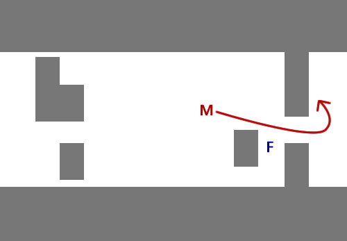
(Marine in red, Freeman in blue, cover structure in grey, the white space is empty.)
Marines are not very picky about their choice of cover when the behavior is triggered. Sometimes, they’ll seek a piece of cover which is on the other side of Freeman, meaning they have to pass right by him while he fires. This bit of design has been fixed by Half-Life’s inheritors, who have used methods like threat gradients and invisible beacons which call enemies to pieces of cover specifically. Indeed, this might be Half-Life’s most antiquated design idea. We can still learn from watching enemies take cover, because that tells us something about the cover design of the set pieces, but the underlying design idea is only remarkable for its place in the history of FPS design.
Movement jitter, on the other hand, means that enemies in Half-Life (mostly marines) have irregularities deliberately programmed into their movement patterns. When cover-seeking behaviors are not active, the first priority of a marine is to acquire line of sight on Freeman. After that happens, the enemy's behavior then gains the movement jitter attribute. Movement jitter usually means that an enemy will take stuttering steps while firing upon Freeman. At range, these steps are short and somewhat frequent. In close quarters, enemies can move quite a bit in between shots. Below I have compared Half-Life’s movement jitter to its predecessor behaviors in the Wolfenstein, Doom and Quake games.
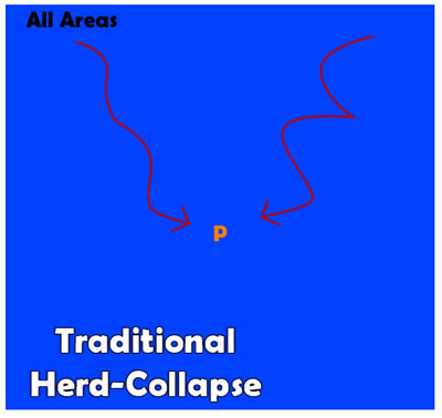
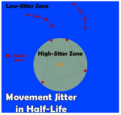
Because I do not have access to the decompiled code of Half-Life, I can't determine how the high-jitter, point-blank zone works. (The Half-Life SDK has many tools, but it doesn’t instantly recreate the AI as it exists in Half-Life.) It may be that the principal line-of-sight-seeking behavior causes enemies to prefer a longer range, secondarily causing them to perform a run that appears highly jittery. It may be that any enemy who reaches point-blank range is subject to cover-seeking behaviors. Nevertheless, the practical effect of point-blank range on the AI makes enemies run around in unpredictable ways, even when they do not appear to seek cover. As far as the player's experience goes, the extreme movement jitter of point-blank range seems only like an exaggeration of the same behavior that is occurring at long range. Ultimately, it's easy to see how the development of movement jitter was an important mechanical evolution in the history of FPS campaigns. While many aspects of single-player campaigns before Half-Life prepared the player for the level-design aspects of multiplayer combat, it was rare for single-player enemies to approximate real players in their behavior. No game-based AI can ever match the resourcefulness or intuition of a human player, but by giving the player a more difficult target, Half-Life made its single-player campaign more interesting, and its multiplayer experience more accessible (if only slightly so).